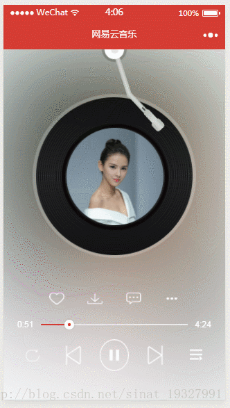
下面代码的效果是网易云音乐唱针和黑胶唱片的CSS效果实现方式,播放等并没贴出来
实现效果的范围

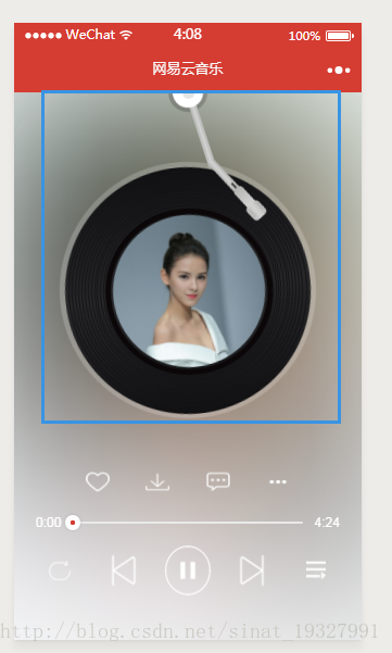
动态图效果预览:
stylusW,panW是获取系统宽度计算后的参数
wxml部分:
  <!-- 黑胶唱片唱针部分 -->
  <view class='stylusBox' style='top: {{ -stylusW*0.5 }}px'>
    <view class='stylus_1' style='width: {{ stylusW }}px; height: {{ stylusW }}px'>
      <view class='stylus_2'>
        <view class='stylus_3'></view>
        <view class='stylus_4' style='top: {{ stylusW*0.8 }}px'>
          <view class='stylus_5'>
            <view class='stylus_6'></view>
            <view class='stylus_7'>
              <view class='stylus_8'>
                <view class='stylus_9 stylus_10'></view>
                <view class='stylus_9 stylus_11'></view>
              </view>
            </view>
          </view>
        </view>
      </view>
    </view>
  </view>

  <!-- 黑胶唱片部分 -->
  <view class='level_1' style='width: {{ panW*0.9 }}px; height: {{ panW*0.9 }}px'>
    <view class='level_2'>
      <view class='level_3'>
        <view class='level_3'>
          <view class='level_3'>
            <view class='level_3'>
              <view class='level_3'>
                <view class='level_3'>
                  <view class='level_3'>
                    <view class='level_3'>
                      <view class='level_3'>
                        <view class='level_3'>
                          <view class='level_3'>
                            <view class='level_3'>
                              <view class='level_3 level_4'>
                                <view class='level_3 level_5'>
                                  <image src='http://singerimg.kugou.com/uploadpic/softhead/400/20160715/20160715112816750.jpg'></image>
                                </view>
                              </view>
                            </view>
                          </view>
                        </view>
                      </view>
                    </view>
                  </view>
                </view>
              </view>
            </view>
          </view>
        </view>
      </view>
    </view>
  </view>
</view>
wxss部分:
/**
 * 黑胶唱片唱针样式效果
 */
.stylusBox{
  position: absolute;
  width: 100%;
  display: flex;
  justify-content: center;
}

.stylus_1{
  background-color: rgba(0, 0, 0, 0.2);
  border-radius: 50%;
  position: relative;
  z-index: 1;
  transform:rotate(-18deg);
  transition: all 2s ease-in-out;
  animation: mymovess 2s;
}

@keyframes mymovess{
  from {
    transform:rotate(-40deg);
  }
  to {
    transform:rotate(-18deg);
  }
}

.stylus_2{
  width: 76%;
  height: 76%;
  border-radius: 50%;
  margin: 12%;
  background-color: #ffffff;
  display: flex;
  justify-content: center;
  align-items: center;
  z-index: 2;
}

.stylus_3{
  width: 40%;
  height: 40%;
  border-radius: 50%;
  background-color: #e5e5e5;
}

.stylus_4{
  width: 20%;
  height: 170%;
  position: absolute;
  z-index: -1;
  border-radius: 50px;
  background: linear-gradient(to right, #b3b3b1, #d3d3d3, #b3b3b1);
}

.stylus_5{
  width:100%;
  height:56%;
  position:relative;
  bottom:-88%;
  left: 18rpx;
  background: linear-gradient(to right, #b3b3b1, #d3d3d3, #b3b3b1);
  transform:rotate(-25deg);
}

.stylus_6{
  width: 30%;
  height: 20%;
  background-color: #3e3e3e;
  position: absolute;
  bottom: 0;
  left: 35%;
  border-radius: 10px 10px 0 0;
}

.stylus_7{
  width: 135%;
  height: 60%;
  border-radius: 5px 5px 0 0;
  position: absolute;
  bottom: -58%;
  left: -15%;
  background: linear-gradient(#b3b3b1, #d3d3d3);
}

.stylus_8{
  width: 150%;
  height: 75%;
  position: relative;
  bottom: -98%;
  left: -6rpx;
  border-radius: 5px;
  background: linear-gradient(to right, #b3b3b1, #d3d3d3, #b3b3b1);
}

.stylus_9{
  width: 8%;
  height: 50%;
  background-color: #b1b1b1;
  position: absolute;
  top: 20%;
}

.stylus_10{
  left: 8rpx;
}

.stylus_11{
  left: 30rpx;
}

/**
 * 黑胶唱片样式效果
 */
.level_1{
  background-color: rgba(255, 255, 255, 0.2);
  margin: 0 auto;
  position: relative;
  top: 150rpx;
  border-radius: 50%;
  padding: 1.5%;
  animation: mymove 10s linear infinite;
  animation-delay: 2s;
}

@keyframes mymove
{
  from {
    transform:rotate(0deg);
  }
  to {
    transform:rotate(360deg);
  }
}

.level_2{
  width: 97%;
  height: 97%;
  background-color: #262628;
  border-radius: 50%;
  padding: 1.5%;
  background: linear-gradient(#101012, #272729, #101012);
}

.level_3{
  width:97%;
  height:97%;
  border:1px solid #131315;
  border-radius:50%;
  padding:1%;
}

.level_4{
  height: 92%;
  width: 92%;
  border: 5px solid #0b0708;
}

.level_5{
  width: 100%;
  height: 100%;
  border: none;
  padding: 0;
}

.level_5>image{
  width: 100%;
  height: 100%;
  border-radius:50%;
}转载自原文链接, 如需删除请联系管理员。
原文链接:微信小程序 --- CSS实现仿网易云音乐播放界面效果(黑胶唱片与唱针纯CSS实现),转载请注明来源!