一、Seaborn介绍

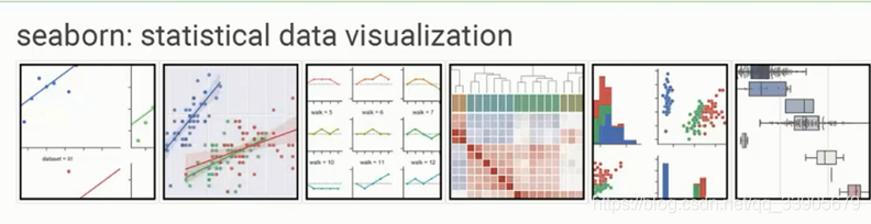
二、整体风格展示
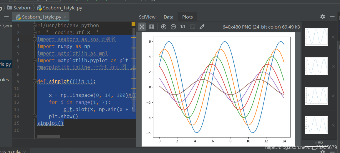
代码:Seaborn_1Style.py
import seaborn as sns #别名
import numpy as np
import matplotlib as mpl
import matplotlib.pyplot as plt
#matplotlib inline 一会进行画图,直接可以把图显示在jupyter中,pycharm不适用
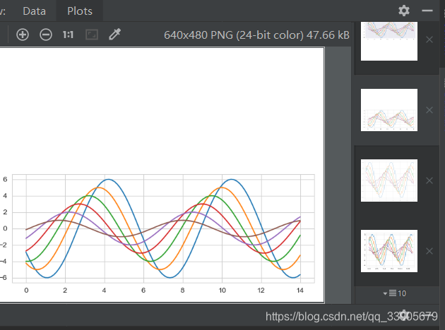
def sinplot(flip=1):
x = np.linspace(0, 14, 100)#在0-14区间上找出来100个点,linspace是Matlab中的均分计算指令,用于产生x1,x2之间的N点行线性的矢量。
for i in range(1, 7):
plt.plot(x, np.sin(x + i * .5) * (7 - i) * flip)#画6条
plt.show()
sinplot()
- #matplotlib inline是jupyter notebook在线显示的功能,这里注释掉了,在代码行的倒数第二行加了个plt.show()也是显示代码
- sinplot()是调用函数
- np.lispace(X1,X2,N),linspace是均分计算指令,用于产生x1,x2之间的N点行线性的矢量。
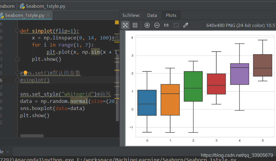
sns.set()#默认的参数
sinplot()
- 传入默认的参数,和前面有细微区别
5种主题风格
- darkgrid
- whitegrid
- dark
- white
- ticks
sns.set_style("whitegrid")#画风
data = np.random.normal(size=(20, 6)) + np.arange(6) / 2
sns.boxplot(data=data)
#sns.despine(left=True)  left隐藏坐标轴
plt.show()
- whitefrid箱形图
- boxplot()在收藏夹里有特别注释
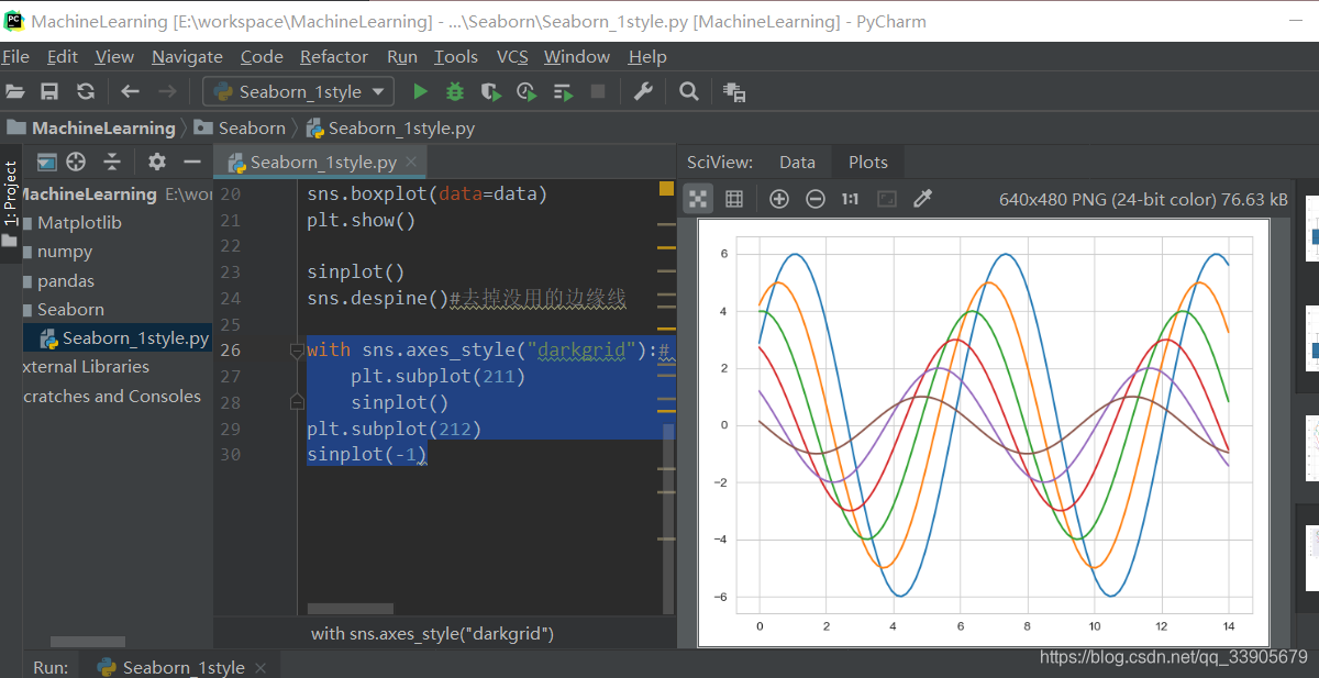
三、风格细节设置
代码:Seaborn_1Style.py
with sns.axes_style("darkgrid"):# 用with打开 当前风格里执行就是这个风格
    plt.subplot(211)
    sinplot()
plt.subplot(212)
sinplot(-1)
- with里的风格相同
sns.set_context("paper")#指定不同的context里的格子不一样
plt.figure(figsize=(8, 6))
sinplot()
- context()是网格大小 有paper小,talk,poster
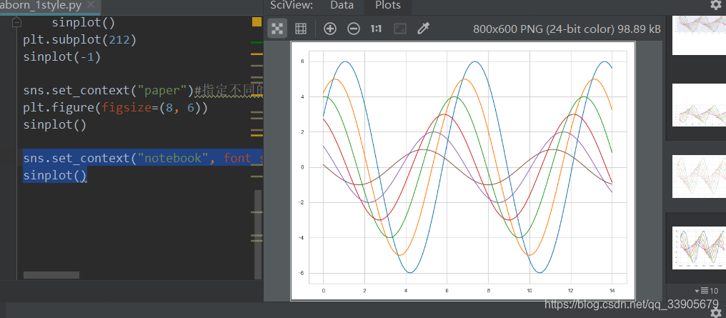
sns.set_context("notebook", font_scale=1.5, rc={"lines.linewidth": 2.5})#对其他位置的字体也可以设置大小,rc是线的粗度
sinplot()
- 见代码注释

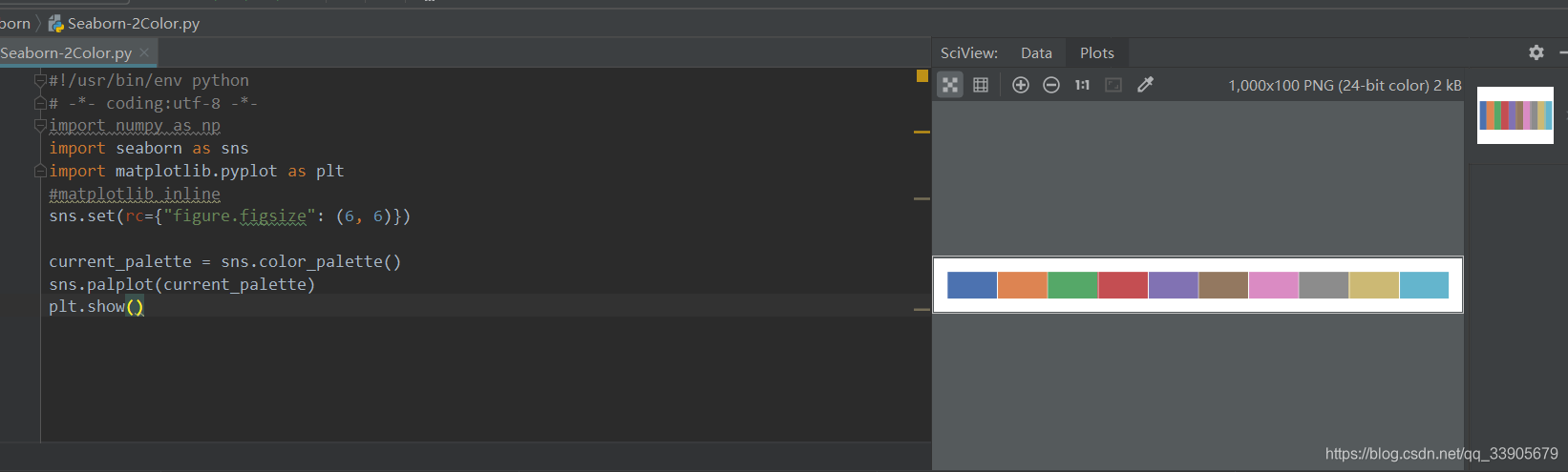
四、调色板
代码:Seaborn_2Color.py
颜色很重要
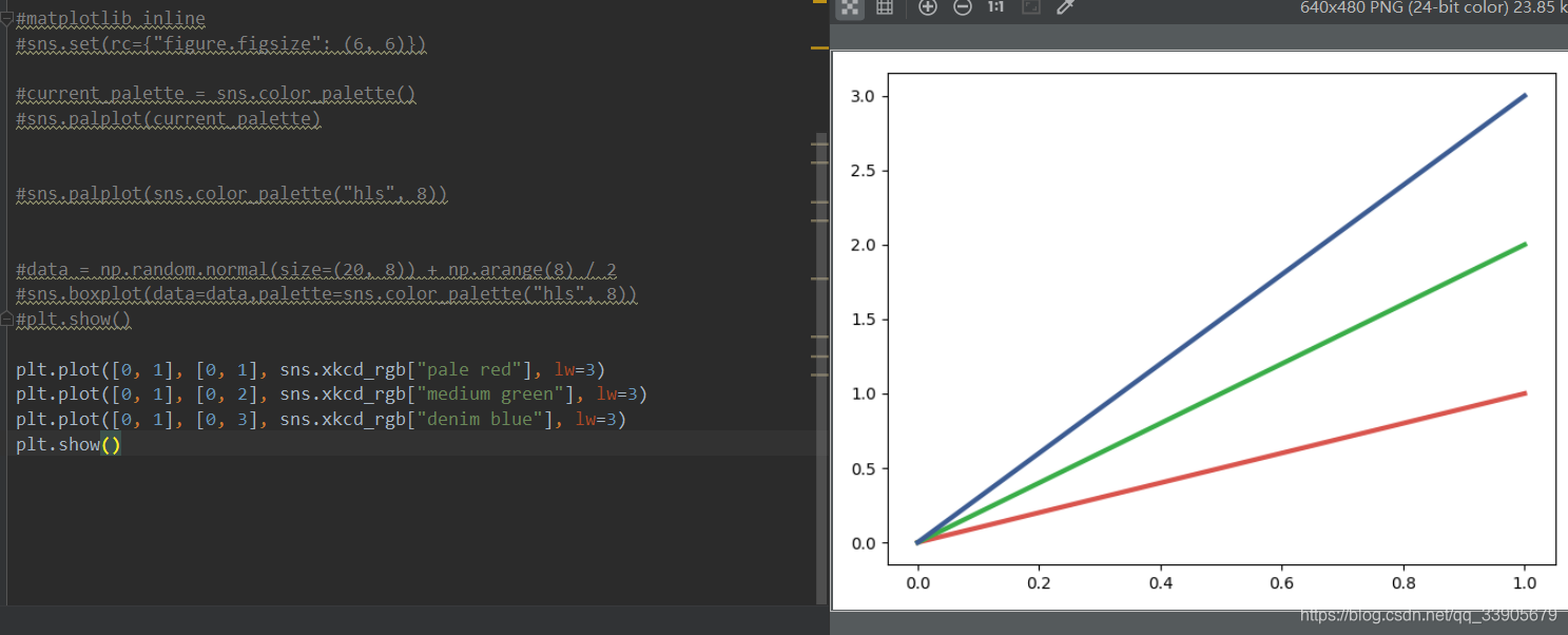
- color_palette()能传入任何Matplotlib所支持的颜色
- color_palette()不写参数则默认颜色
- set_palette()设置所有图的颜色
import numpy as np
import seaborn as sns
import matplotlib.pyplot as plt
#matplotlib inline
sns.set(rc={"figure.figsize": (6, 6)})

current_palette = sns.color_palette()
sns.palplot(current_palette)
plt.show()
- 6个默认的颜色循环主题: deep, muted, pastel, bright, dark, colorblind
- 这里有十种
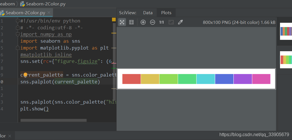
圆形画板
当你有六个以上的分类要区分时,最简单的方法就是在一个圆形的颜色空间中画出均匀间隔的颜色(这样的色调会保持亮度和饱和度不变)。这是大多数的当他们需要使用比当前默认颜色循环中设置的颜色更多时的默认方案。

最常用的方法是使用hls的颜色空间,这是RGB值的一个简单转换。
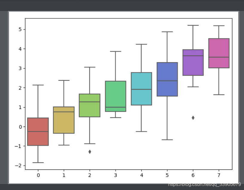
sns.palplot(sns.color_palette("hls", 8))
- 有8个颜色
data = np.random.normal(size=(20, 8)) + np.arange(8) / 2
sns.boxplot(data=data,palette=sns.color_palette("hls", 8))
plt.show()
- 看到代码里的palette=sns.color_palette(“hls”, 8)就是设置颜色
hls_palette()函数来控制颜色的亮度和饱和
- l-亮度 lightness
- s-饱和 saturation
sns.palplot(sns.hls_palette(8, l=.7, s=.9))
- 可以换出来8种颜色,l s和亮度和饱和度
sns.palplot(sns.color_palette("Paired",8))
- "Paired"表示现在要求调色板是一对一对的,8个数据4对

五、调色板颜色设置
使用xkcd颜色来命名颜色
xkcd包含了一套众包努力的针对随机RGB色的命名。产生了954个可以随时通过xdcd_rgb字典中调用的命名颜色。
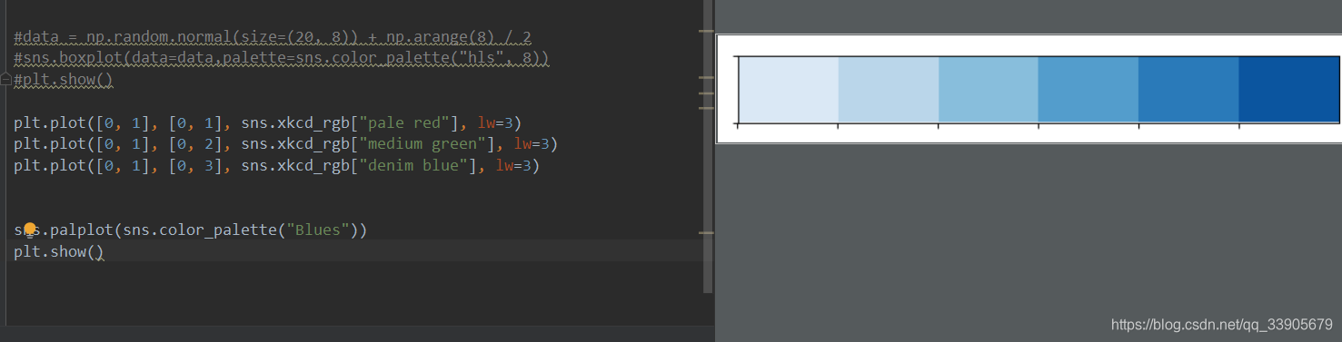
连续色板
色彩随数据变换,比如数据越来越重要则颜色越来越深
sns.palplot(sns.color_palette("Blues"))
sns.palplot(sns.color_palette("BuGn_r"))
- 如果想要翻转渐变,可以在面板名称中添加一个_r后缀`
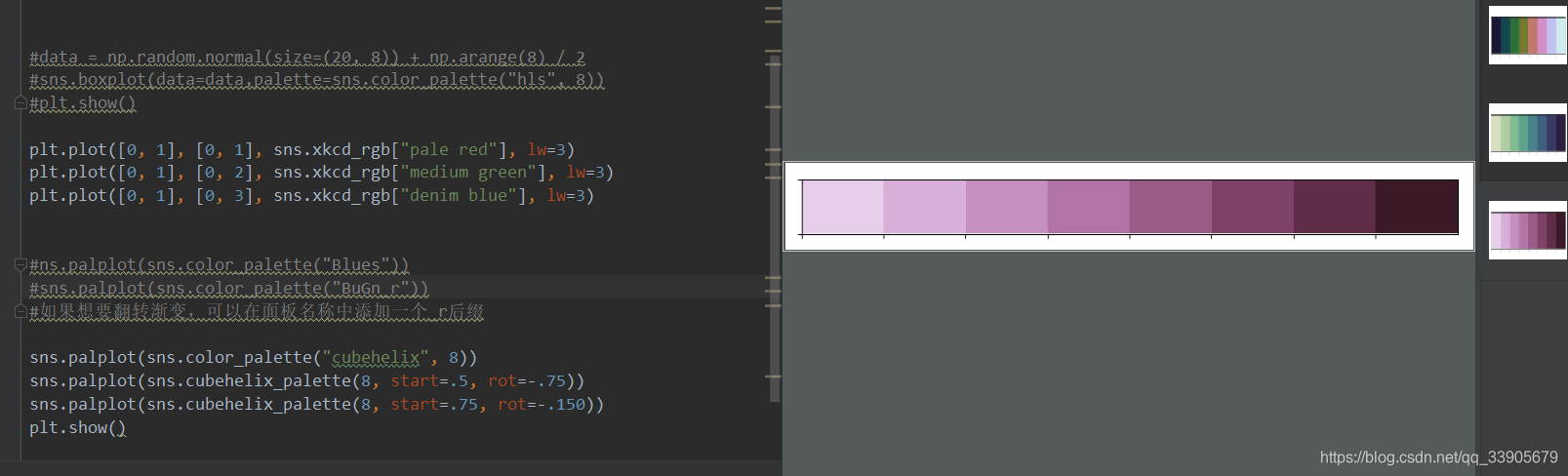
cubehelix_palette()调色板
色调线性变换

sns.palplot(sns.color_palette("cubehelix", 8))
sns.palplot(sns.cubehelix_palette(8, start=.5, rot=-.75))
sns.palplot(sns.cubehelix_palette(8, start=.75, rot=-.150))
plt.show()
- start rot区间
light_palette() 和dark_palette()调用定制连续调色板*
sns.palplot(sns.light_palette("green"))
sns.palplot(sns.dark_palette("purple"))
sns.palplot(sns.light_palette("navy", reverse=True))
- light_或者dark_
- reverse反转
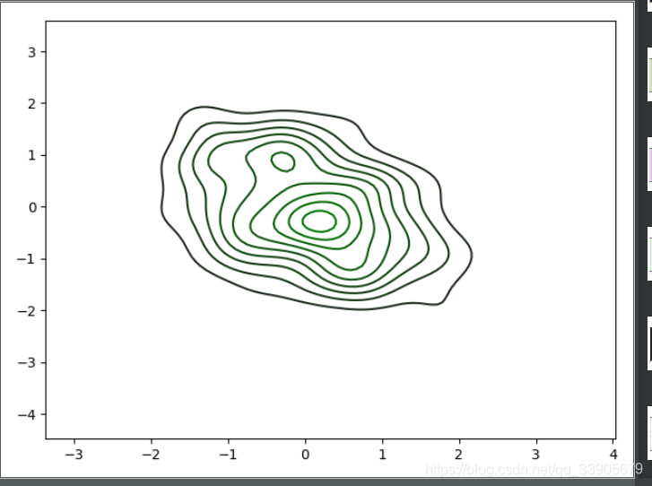
代码示意:

x, y = np.random.multivariate_normal([0, 0], [[1, -.5], [-.5, 1]], size=300).T
pal = sns.dark_palette("green", as_cmap=True)
sns.kdeplot(x, y, cmap=pal);
plt.show()
六、单变量分析绘图
代码:Untitiled.py
import numpy as np
import pandas as pd
from scipy import stats, integrate
import matplotlib.pyplot as plt
import seaborn as sns
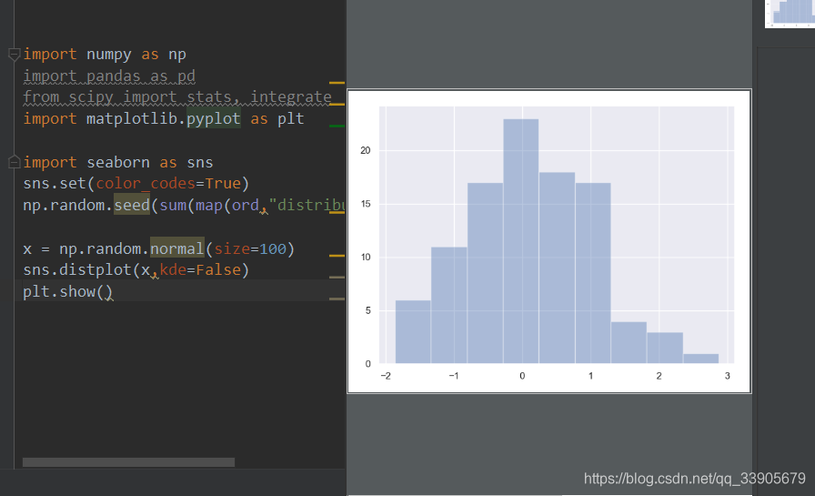
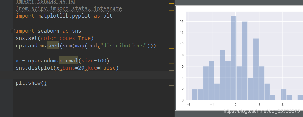
sns.set(color_codes=True)
np.random.seed(sum(map(ord,"distributions")))
x = np.random.normal(size=100)
sns.distplot(x,bins=20,kde=False)
plt.show()
- 随机生成高斯数据
- kde是要不要作核密度的估计?(后面会讲)
- bins是要不要切分成20块
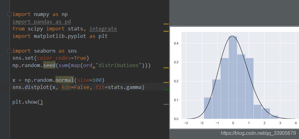
sns.distplot(x, kde=False, fit=stats.gamma)
- 统计指标下分布的状态
指定均值和协方差
mean, cov =[0,1], [(1,.5), (.5, 1)]
data = np.random.multivariate_normal(mean,cov,200)
df = pd.DataFrame(data,columns=["x","y"])
print(df)
- 指定均值和协方差
数据: x y
0 -0.706021 1.349229
1 1.547416 2.047840
2 -0.047346 -0.240343
3 -0.148089 -0.331725
4 -0.333231 -0.148247
5 -0.490702 0.978690
6 -2.011982 -0.014544
7 1.014579 1.099924
8 -0.391629 1.751079
9 -1.174984 0.521832
10 -0.629024 1.179699
11 0.115480 1.674041
12 1.402709 2.475423
13 0.370949 1.424186
14 -1.010483 -0.728499
15 -0.100091 1.889943
16 -1.397263 0.064460
17 -0.827628 2.089991
18 0.473680 2.546941
19 -0.118779 -0.033703
20 -0.436781 1.007733
21 -0.451587 0.619218
22 -1.318746 0.395063
23 -0.231098 1.390841
24 -0.962049 -0.856978
25 -0.367885 1.475165
26 2.309267 1.125499
27 0.137392 0.383759
28 -0.331646 1.043289
29 -0.510458 -0.127161
… … …
170 -1.053425 -1.997191
171 -1.419759 -0.378324
172 -1.534222 0.706716
173 -0.258498 -0.701965
174 -1.155324 0.249849
175 0.598661 1.496255
176 0.014828 -0.651260
177 0.575165 1.249223
178 0.617901 1.183245
179 0.096636 0.402979
180 -1.208809 1.309929
181 -1.211455 -0.084806
182 0.192729 1.982614
183 0.100879 0.122719
184 -0.257234 0.979881
185 0.598534 0.345175
186 0.613458 1.384217
187 -1.427276 1.611468
188 -0.671112 0.980476
189 1.466258 1.476073
190 -0.072922 -0.957640
191 -2.090895 0.399472
192 -0.409107 0.831832
193 -0.780861 1.222904
194 -2.088611 0.049060
195 0.024923 1.114246
196 0.161253 0.647625
197 -0.149565 0.251271
198 -0.320356 0.460674
199 0.403799 1.421273
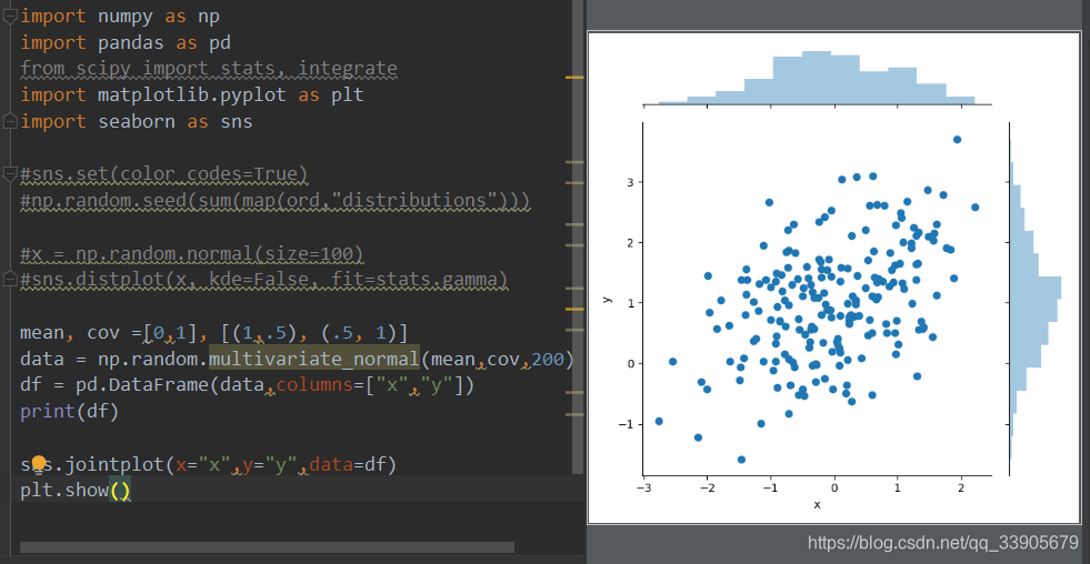
散点图
观测两个变量之间的关系最好用散点图
sns.jointplot(x="x",y="y",data=df)
plt.show()
- 不仅可以画出散点图也可以画出直方图
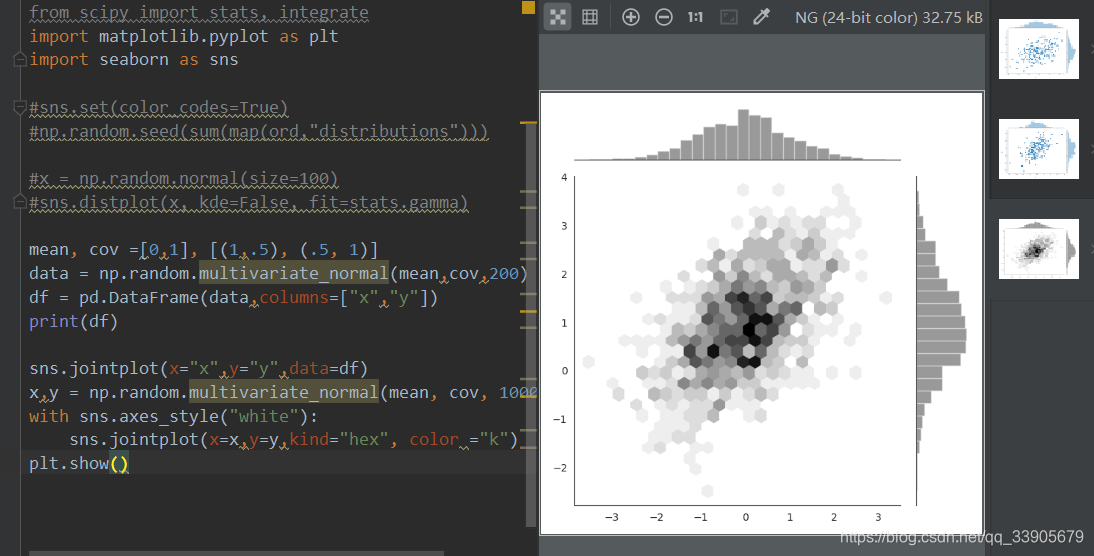
x,y = np.random.multivariate_normal(mean, cov, 1000).T
with sns.axes_style("white"):
    sns.jointplot(x=x,y=y,kind="hex", color ="k")
- 数据比较多,有1000个
七、回归分析绘图
代码:Untitiled_1.py
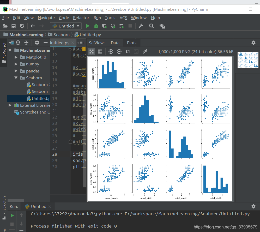
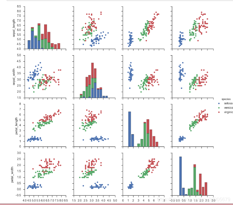
iris = sns.load_dataset("iris")#内置数据集
sns.pairplot(iris)
plt.show()
- sns.pairplot自动分析
import numpy as np
import pandas as pd
import matplotlib as mpl
import matplotlib.pyplot as plt
import seaborn as sns
sns.set(color_codes=True)
np.random.seed(sum(map(ord,"regression")))
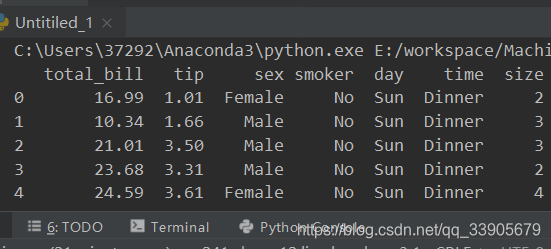
tips = sns.load_dataset("tips")
print(tips.head())
*regplot()和lmplot()都可以画回归图,推荐用regplot()
*
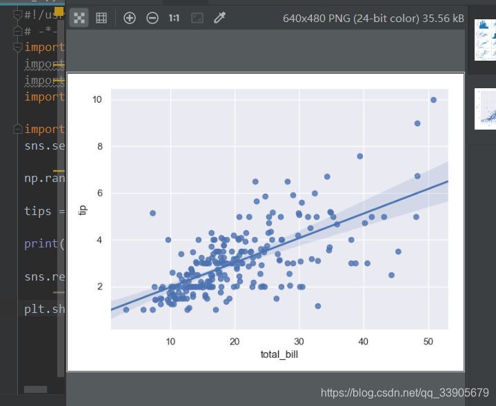
sns.regplot(x="total_bill", y="tip", data=tips)

plt.show()
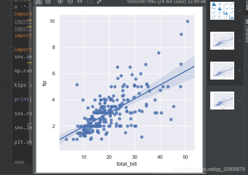
sns.lmplot(x="total_bill", y="tip", data=tips)
- lmplot在这里跟regplot差不多,只是支持更高级的操作
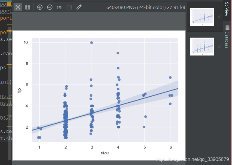
sns.regplot(data=tips,x="size",y="tip")
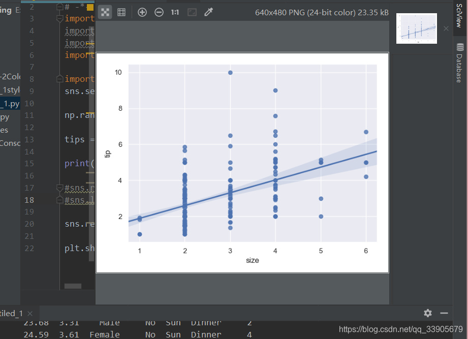
sns.regplot(x="size",y="tip",data=tips,x_jitter =.05)
- x_jitter 指定了幅度范围,进行随机的一些改变
八、多变量分析绘图
代码:Untitiled_2.py
import numpy as np
import pandas as pd
import matplotlib as mpl
import matplotlib.pyplot as plt
import seaborn as sns
sns.set(style = "whitegrid",color_codes=True)
np.random.seed(sum(map(ord,"categorical")))
titanic= sns.load_dataset("titanic")
tips = sns.load_dataset("tips")
iris = sns.load_dataset("iris")
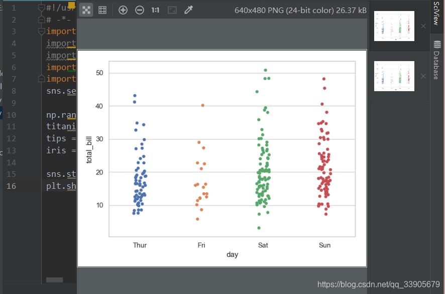
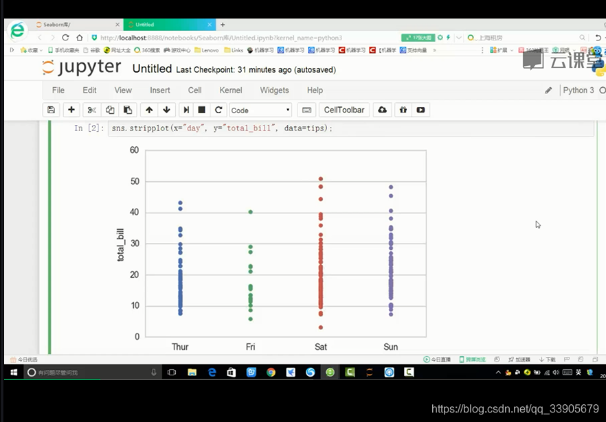
sns.stripplot(x="day",y="total_bill",data=tips)#stripplot
plt.show()
- 为什么我的不是线??他的数据显示的是线??我迷茫了,代码没有问题。
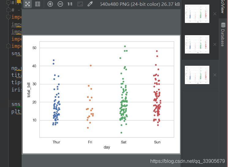
sns.stripplot(x="day",y="total_bill",data=tips,jitter = True)#stripplot
- jitter就是偏移量
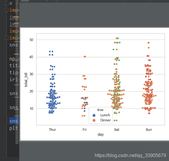
sns.swarmplot(x="day",y="total_bill",data=tips)

sns.swarmplot(x="day",y="total_bill",hue = "time",data=tips)
盒图
- IQR即统计学的四分位距,第一四分位与第三四分位之间的距离
- N=1.5IQR 如果一个值>Q3+N或<Q1-N,则为离群点
- 离群点:异常值或统计错误
sns.boxplot(x="day",y="total_bill",hue="time",data=tips)
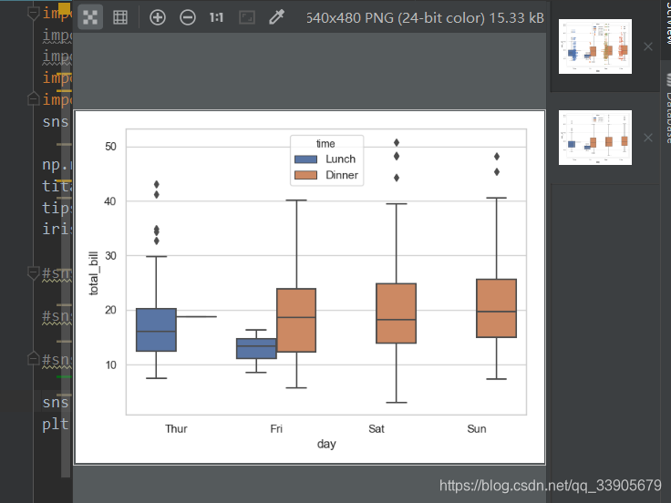
- 图中的菱形 是离群点 的个数和数据
sns.violinplot(x="total_bill",y="day",hue="time",data=tips)
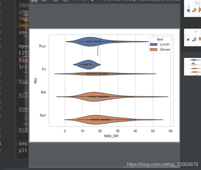
- 越胖表示数据越多
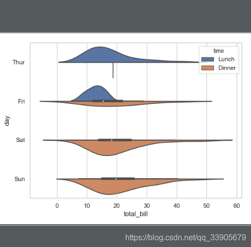
sns.violinplot(x="total_bill",y="day", hue="time",data=tips, split=True)
九、分类属性绘图
代码:Untitiled_3.py
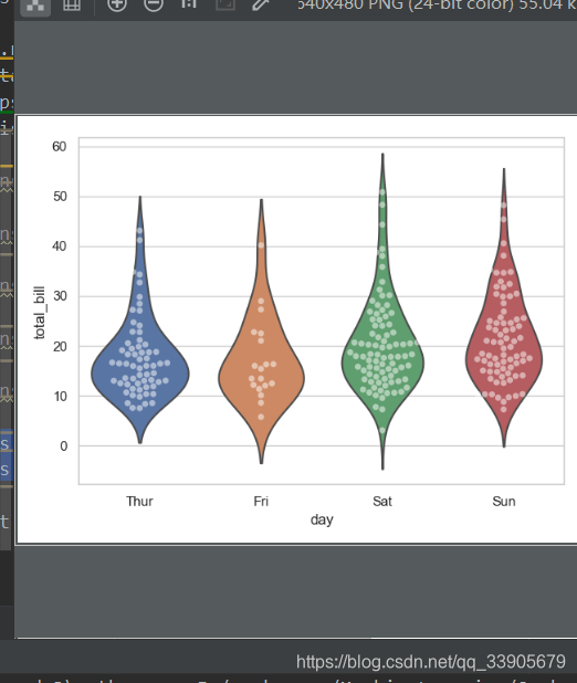
sns.violinplot(x="day",y="total_bill",data=tips,inner=None)
sns.swarmplot(x="day",y="total_bill",data=tips,color="w",alpha=.5)
- alpha 透明程度设置
显示值的集中趋势可以用条形图
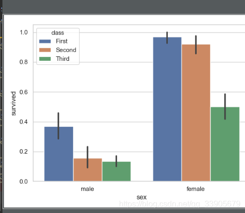
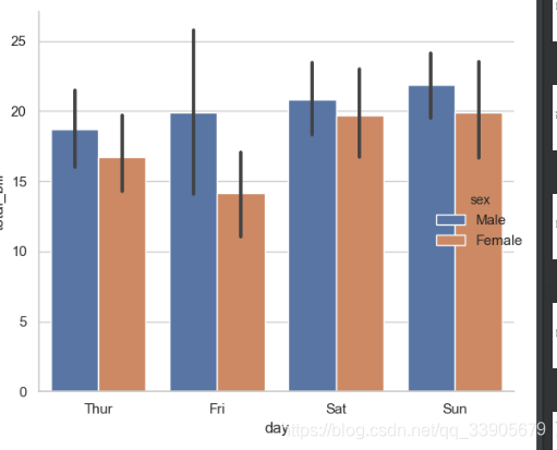
sns.barplot(x="sex",y="survived",hue="class",data=titanic)
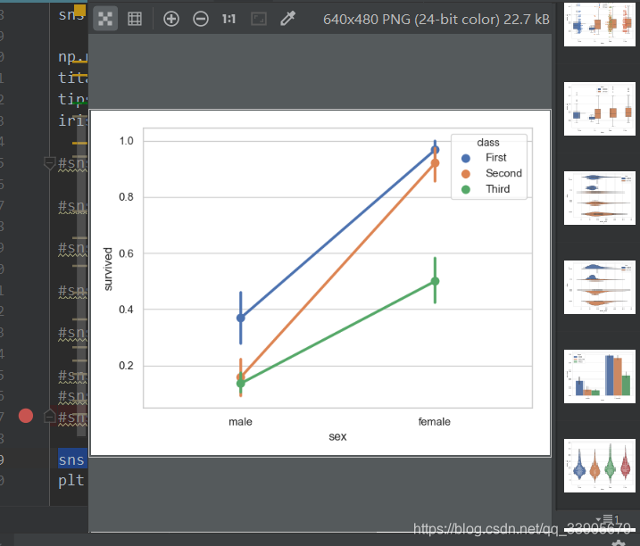
- 点图可以看到更多的描述差异
sns.pointplot(x="sex",y="survived",hue="class",data=titanic)
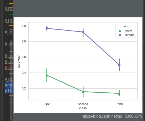
sns.pointplot(x="class",y="survived",hue="sex",data=titanic,palette={"male":"g","female":"m"},markers=["^","o"],linestyle=["-","--"])
plt.show()
宽型数据
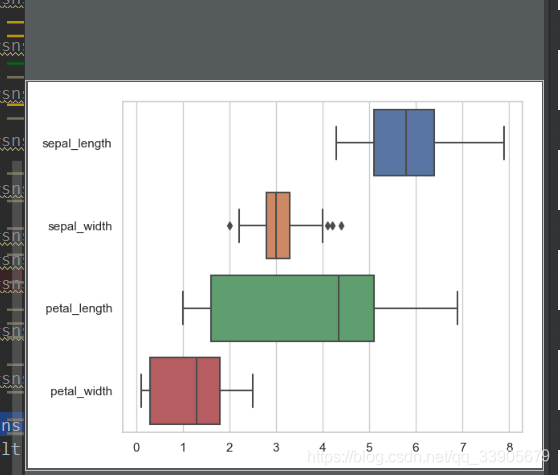
sns.boxplot(data=iris,orient="h")
- 横着画指定成h
sns.factorplot(x="day",y="total_bill",hue="sex",data=tips,kind="bar")
- factorplot可以画很多种图,只要指定好kind
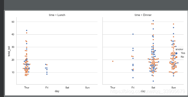
sns.factorplot(x="day",y="total_bill",hue="smoker",col="time",data=tips,kind="swarm")
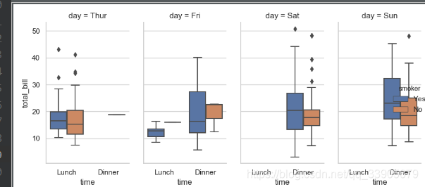
sns.factorplot(x="time",y="total_bill",hue="smoker",col="day",data=tips,kind="box",size=4,aspect=.5)
解释看PYTHON函数解释。
十、Facetgrid使用方法
代码:Untitiled_1.py
t = sns.FacetGrid(tips,col="time")
- 制定好要画的区域图的哪些信息
- col两个图表示时间指标有2个
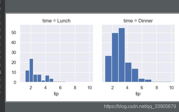
g = sns.FacetGrid(tips,col="time")
g.map(plt.hist,"tip")
- plt.hist 条形图
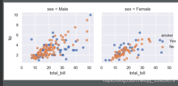
g = sns.FacetGrid(tips,col="sex",hue="smoker")
g.map(plt.scatter,"total_bill","tip",alpha=.7)
g.add_legend()
- scatter散点图
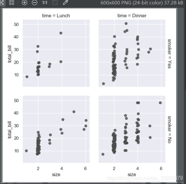
g = sns.FacetGrid(tips,row="smoker",col="time",margin_titles=True)
g.map(sns.regplot,"size",'total_bill',color=".3",fit_reg=False,x_jitter=.1)
- fit_reg是否回归线
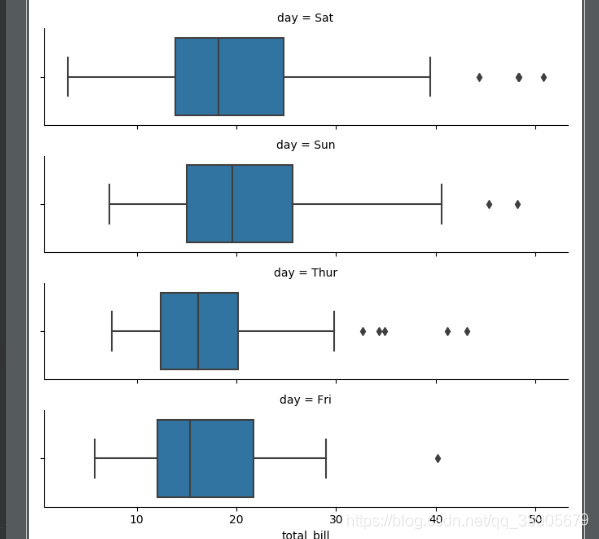
from pandas import Categorical
ordered_days = tips.day.value_counts().index
print(ordered_days)
#ordered_days = Categorical(['Thur','Fri','Sat','Sun'])
g=sns.FacetGrid(tips,row="day",row_order=ordered_days,size=1.7,aspect=.4)
g.map(sns.boxplot,"total_bill")
- 指定数据的顺序,传数据传入dataframe的类型
输出:
CategoricalIndex([‘Sat’, ‘Sun’, ‘Thur’, ‘Fri’], categories=[‘Thur’, ‘Fri’, ‘Sat’, ‘Sun’], ordered=False, dtype=‘category’)
十一、Facetgrid绘制多变量
代码:Untitiled_1.py
代码1:Jupyter notebook上FacetGrid
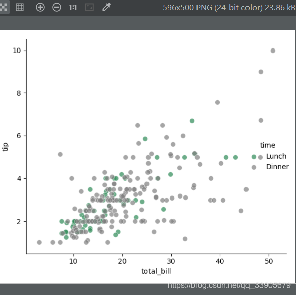
pal = dict(Lunch="seagreen", Dinner="gray")
g = sns.FacetGrid(tips, hue="time", palette=pal, size=5)
g.map(plt.scatter, "total_bill", "tip", s=50, alpha=.7, linewidth=.5, edgecolor="white")
g.add_legend();
plt.show()
- palette调色板
- pal字典的颜色
- g.add_legend();加上标签项
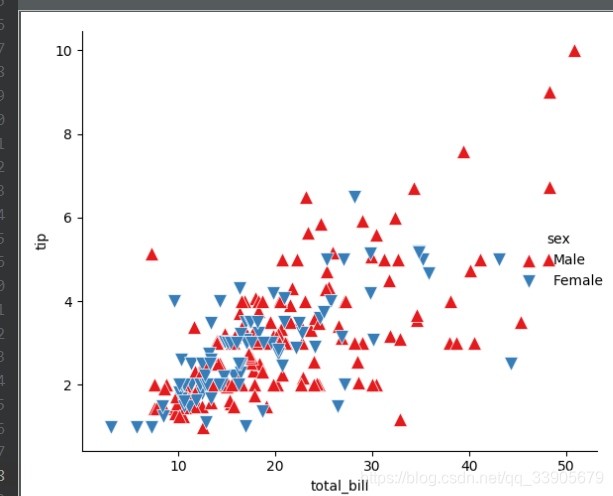
g = sns.FacetGrid(tips, hue="sex", palette="Set1", size=5, hue_kws={"marker": ["^", "v"]})
g.map(plt.scatter, "total_bill", "tip", s=100, linewidth=.5, edgecolor="white")
g.add_legend();
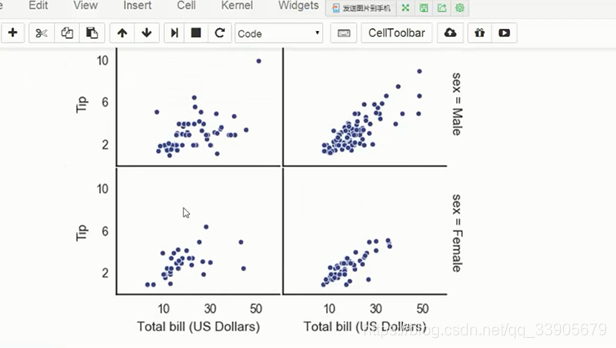
with sns.axes_style("white"):
    g = sns.FacetGrid(tips, row="sex", col="smoker", margin_titles=True, size=2.5)
g.map(plt.scatter, "total_bill", "tip", color="#334488",edgecolor="white", lw=.5)
g.set_axis_labels("Total bill (US Dollars)", "Tip")
g.set(xticks=[10, 30, 50], yticks=[2, 6, 10])
g.fig.subplots_adjust(wspace=.02, hspace=.02)
#g.fig.subplots_adjust(left  = 0.125,right = 0.5,bottom = 0.1,top = 0.9, wspace=.02, hspace=.02)
- 用with指定了图
- set_axis_labels把轴指定成名字是什么东西
- set(xticks=[10, 30, 50], yticks=[2, 6, 10])表示轴的一个取值范围
- .subplots_adjust(left = 0.125,right = 0.5,bottom = 0.1,top = 0.9, wspace=.02, hspace=.02)
- hspace宽距和h距
- g.fig.subplots_adjust(left = 0.125,right = 0.5,bottom = 0.1,top = 0.9, wspace=.02, hspace=.02)
- 整体的偏移程度 在上面
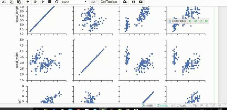
iris = sns.load_dataset("iris")
g = sns.PairGrid(iris)
g.map(plt.scatter);
g = sns.PairGrid(iris, hue="species")
g.map_diag(plt.hist)
g.map_offdiag(plt.scatter)
g.add_legend();
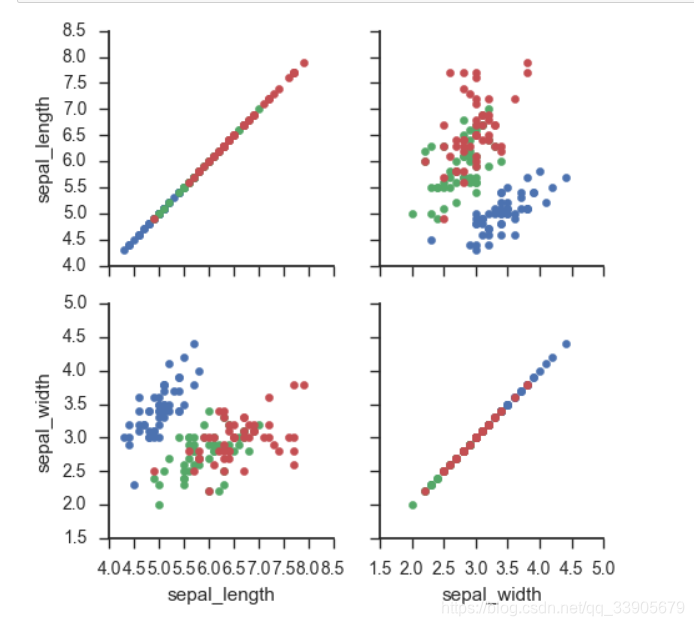
g = sns.PairGrid(iris, vars=["sepal_length", "sepal_width"], hue="species")
g.map(plt.scatter);
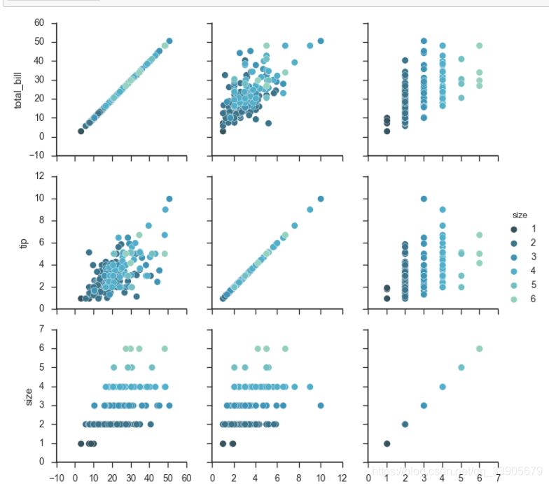
g = sns.PairGrid(tips, hue="size", palette="GnBu_d")
g.map(plt.scatter, s=50, edgecolor="white")
g.add_legend();
十二、热度图绘制
代码:HeatMap.py
#HeatMap 热点图 在那个点高 那个点低
import matplotlib.pyplot as plt
import numpy as np;
np.random.seed(0)
import seaborn as sns;
sns.set()
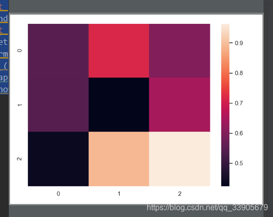
uniform_data = np.random.rand(3, 3)#随机生成3x3的矩阵
print (uniform_data)
heatmap = sns.heatmap(uniform_data)
plt.show()
输出:
[[0.5488135 0.71518937 0.60276338]
[0.54488318 0.4236548 0.64589411]
[0.43758721 0.891773 0.96366276]]
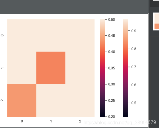
ax = sns.heatmap(uniform_data, vmin=0.2, vmax=0.5)
- vmin右边的调色板最小值,vmax是最大取值范围
- 与上面的输出结果结合起来就是,大于0.5和小于0.2的都是一个颜色
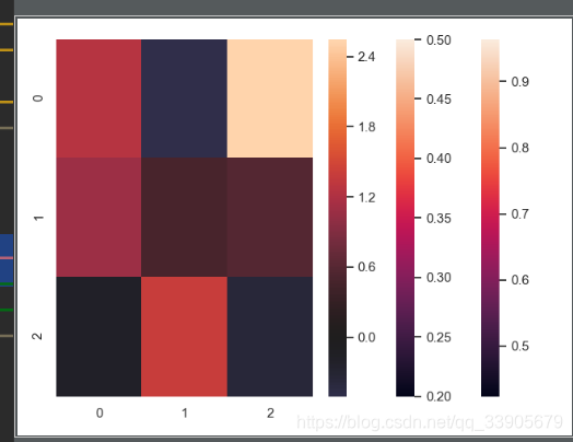
normal_data = np.random.randn(3, 3)
print (normal_data)
ax = sns.heatmap(normal_data, center=0)
- 组权重参数,有正有负。
- ax = sns.heatmap(normal_data, center=0)
- center=0表示以0为中心画
输出:
[[ 1.26611853 -0.50587654 2.54520078]
[ 1.08081191 0.48431215 0.57914048]
[-0.18158257 1.41020463 -0.37447169]]
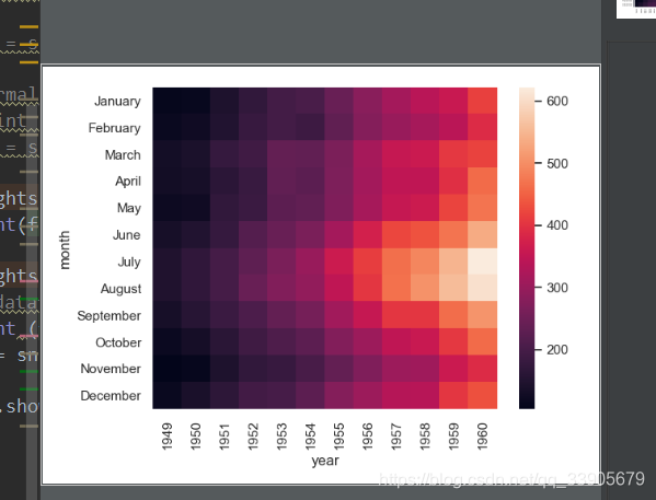
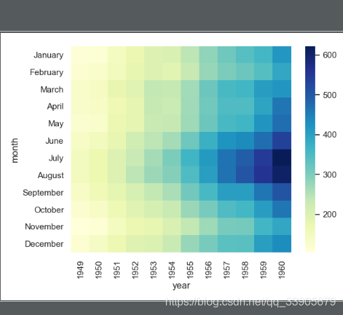
flights = sns.load_dataset("flights")
flights.head()
输出:
year month passengers
0 1949 January 112
1 1949 February 118
2 1949 March 132
3 1949 April 129
4 1949 May 121
flights = flights.pivot("month", "year", "passengers")
#对dataframe转换为年月的形式,横轴年,纵轴月,坐标点就是人数
print (flights)
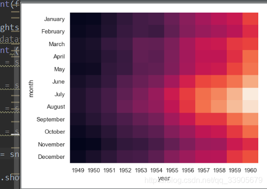
ax = sns.heatmap(flights)
- 对dataframe转换为年月的形式,横轴年,纵轴月,坐标点就是人数
- 右边就是对比bar counter bar
输出:
year 1949 1950 1951 1952 1953 … 1956 1957 1958 1959 1960
month …
January 112 115 145 171 196 … 284 315 340 360 417
February 118 126 150 180 196 … 277 301 318 342 391
March 132 141 178 193 236 … 317 356 362 406 419
April 129 135 163 181 235 … 313 348 348 396 461
May 121 125 172 183 229 … 318 355 363 420 472
June 135 149 178 218 243 … 374 422 435 472 535
July 148 170 199 230 264 … 413 465 491 548 622
August 148 170 199 242 272 … 405 467 505 559 606
September 136 158 184 209 237 … 355 404 404 463 508
October 119 133 162 191 211 … 306 347 359 407 461
November 104 114 146 172 180 … 271 305 310 362 390
December 118 140 166 194 201 … 306 336 337 405 432
[12 rows x 12 columns]
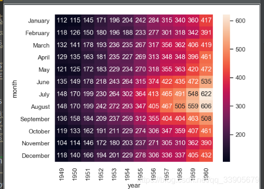
heatmap(flights, annot=True,fmt="d")
- 加上实际的值
- annot是注释,等于true就会显示
- fmt加进来的值用d这种符号表示
ax = sns.heatmap(flights, linewidths=.5)
- linewidths 指定之间的间距
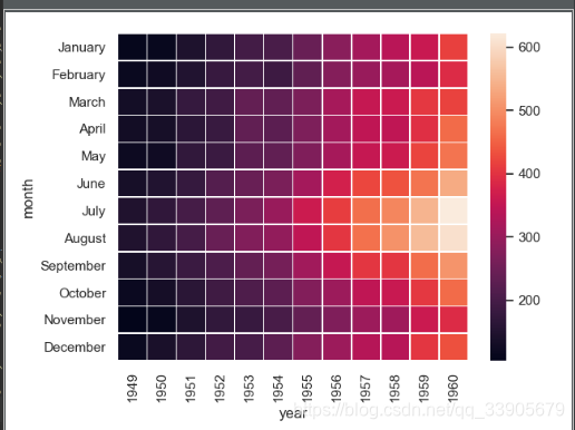
ax = sns.heatmap(flights, cmap="YlGnBu")
- 指定pal调色板
- cmap用于指定
ax = sns.heatmap(flights, cbar=False)
- cbar = False没有柱状指示
转载自原文链接, 如需删除请联系管理员。
原文链接:机器学习入门(一)之可视化库Seaborn,转载请注明来源!